Editor's Note: This article was originally posted on Sustainable Cities Collective's website and is reposted with permission.
William H. Whyte said “It is difficult to design a place that will not attract people. What is remarkable is how often this has been accomplished.” Indeed, walking the streets one can find a myriad of terrible places simply because of the design itself. And make no mistake, they are designed, they’re just designed poorly. When discussing urban design, thankfully, the tone increasingly is that of good design – 20 Minute Neighborhoods, New Urbanism, True Urbanism, Placemaking, Walkability, 8 to 80, Transit Oriented Design, and on and on, each with their core concepts and design standards pushing for more livable cities. But with the myriad of options to choose from, it almost seems easier to instead highlight the other side of the spectrum – poor placemaking – summarized here for your convenience in five easy steps.
1. Don’t Plan for the Place
Heaven forbid you talk to the people who would actually be using and interacting with the place. What do you care? You’re the expert. Why would Joe on the corner understand the comings and goings of the street where he’s run a sandwich shop for fifteen years better than you? That’s just silly. And don’t even think about observing the place itself. If you want to be really ambitious, you could even do the opposite of what everyone else is doing. If they don’t want a highway through their neighborhood, build it anyway! If they think that building is too tall, make it taller! This is about the bottom line, not quality of life, after all.
2. Plan Like it’s 1960
Just let LeCorbusier be your guide. If you just plan like it’s still the 1960s, you’re in good shape! Don’t think about a time when cities were only made for people to walk in or before the era of auto-domination when streets were pubic spaces full of a myriad of transportation modes and spontaneous uses. The bicycle can never come back! Sprawl is your friend! Everyone wants a personal automobile and no one wants to wait for a bus. There’s no way that anyone wouldn’t want to drive or that licenses would decline as time goes on. People don’t want to sit at cafes, socialize in public spaces, or play in the streets, and they never will. Nevermind that it’s fifty years later and new generations have different ideas about urban design.
3. Make Your Walls Blank
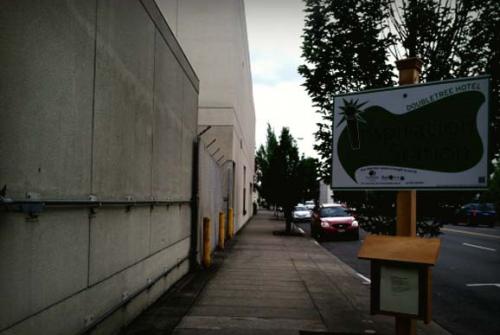
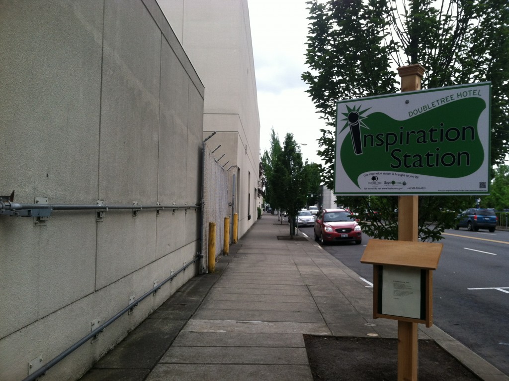
The less windows, the better. If you can make your building so completely boring that no one wants to walk there, you’ve succeeded in making a terrible place. Avoid frequent ground-floor shops with attractive window displays, or cafes that spill out onto the sidewalk creating impromptu opportunities for lively discussion and chance meetings. In fact, you can basically just design your building to be a gigantic blank cube and your work here is done.
Terrible Placemaking 101: Add a poetry board to make the blank wall better. (Photo by author)
4. Distractions, Distractions, Distractions
If you get some criticism – and you might – just add a bit of flair to ease the populous into a state of compliance. If you’ve got your heart set on that blank wall but the city wants more detail, you can add a window or two - small ones, that is. Or just put up a fancy architectural sign to distract from the fact that the building is just a big box. If it’s a road they’re after with street furniture, active streetscapes, and a pedestrian scale, just make it a stroad - six lanes is extremely necessary to ensure those never-changing car-lovers can get from point A to point B in the quickest way possible. Don’t forget the landscaping and planters. Everyone loves planters.
5. Don’t Design for People
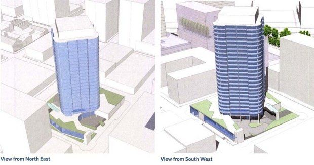
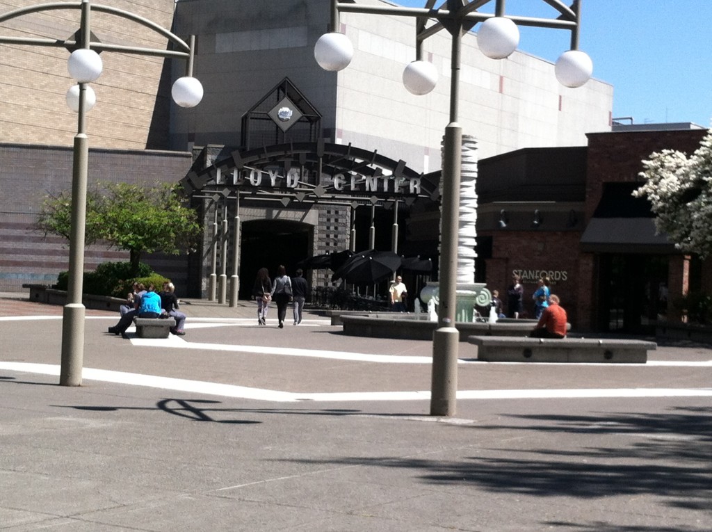
This one is perhaps the most important step. Pretend for a moment that the buildings and streets you’re designing are made for some alien life form other than a human being. Say you’re planning for ants, or I don’t know, lions. Your guess is as good as mine. The more the planning looks like a perfectly proportioned model, the better. Add people for scale, sure, but don’t plan for them. Make that plaza sunken, or add shortcuts between buildings high above the streets. Leave out the sidewalks or better yet, put things in the middle of them to block the way. As long as you don’t design for people, you’ll be on your way making a truly terrible place.


